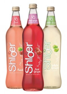
 r SHS Drinks has invested in a packaging refresh to enhanced the appearance of the Shloer 750ml bottle.
The brand will feature the new designs across its core range – Red Grape, White Grape and Rosé, with new stock rolled out to the trade in August.
The neck labels have been enlarged and to help consumers identify the different flavours more easily each variant’s neck label is in a different colour.
More prominence has also been given to the flavour descriptors both on the neck label and in the main body copy on the front of the bottle.
The effervescent ‘bubbles’ depicted on the bottles have also been streamlined to provide a crisper, more contemporary feel to the pack design, whilst the instantly recognizable curvy shape of the bottle has been retained.
Amanda Grabham, marketing director – Soft Drinks at SHS Drinks, said:
“The new packaging is an evolution of the designs which we introduced in 2009, whilst retaining the iconic bottle shape which has become part of Shloer’s DNA.
“The changes are subtle with handwritten rather than typewritten text conveying the relaxed, sociability of the brand and delivering greater standout for ‘grape’ flavour descriptors which reinforce the wine-alcohol alternative connection in consumers’ minds.”


