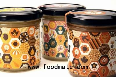
A list might have offered an effective means to describe the features and the ingredients inside of Helt Honey packaging, but where would the appeal be in that branding strategy?
Given that a consumer is far more likely to be enticed by visual stimulation, text was scrapped in favor of an elaborately illustrated label.
Anders Arhoj’s design for the sweet spread jars gives special treatment to all 14 varieties of the bee-derived product.
The winged creators and their hives are certainly referenced within the honeycomb grid of graphics, and so are the specific flowers, key production features and colors that depict the early stages of the scrumptious recipes.
Every six-sided printed tile on Helt Honey packaging frames a cute cartoony symbol of the edible’s essential elements.