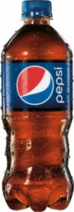
 Pepsi’s 16 oz. and 20 oz. plastic bottles will now display a swirled grip at the bottom, a shorter label bordered with brown edges that resemble the color of the drink, and a larger version of its current globe logo. A 12 oz. glass bottle, soon available in select retailers, will also feature the swirling body and the globe logo bordered with a thick silver line.
The packaging updates, which will roll out to shelves in April, will apply to Pepsi, Diet Pepsi, Pepsi Max and Pepsi Next.
“We started with single serve, because it is the package you’re seen drinking and holding,” Angelique Krembs, VP of marketing for Pepsi, said to Ad Age. “The longer-term view is this new design system would eventually hit all touch points beyond packaging, to be honest, but certainly all other package types, as it applies.”
Krembs said that she expects half the country to be converted to the packaging updates by the end of 2013. She also said that the packaging updates could increase distribution of the 16 oz. bottle, which is not as widely moved as the 20 oz. bottle.
Pepsi introduced its globe logo in 2008 and has been more open to change than rival Coca-Cola, which has stayed true to its red color and scripted font.
Krembs told Ad Age that the idea for a swirling body was influenced by early glass packages from the Pepsi archives. She added that Mountain Dew recently tested a more aggressive swirled grip that performed well in the marketplace. This provided Pepsi with a helpful push toward the new packaging.
“We didn’t want to create a shape that came out of nowhere,” Krembs said. “It’s not uniform, it’s a little asymmetrical, there’s a little edginess and playfulness, which is consistent with Pepsi’s equities and youthful spirit.”