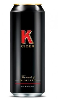
 r from The Shepton Mallet Cider Mill, has unveiled a new look to enhance the brand’s premium positioning.
Sticking with its minimalist design, the new packaging features the red ‘K’ symbol, embossed on a matte black can finish.
For added appeal on shelf, K now boasts a unique gold top combined with a red ring pull, which is discreetly branded with the K mark.
In a sector dominated by loud branding and vivid colour, K believes it is unique with its subtler, more refined appearance.
While the outside of the can showcases a refresh, the liquid inside remains the same: pressed with a blend of English apples to give a full-bodied flavour and golden colour.
The new look coincides with the introduction of a new 330ml can format to capitalise on a resurgence for K in both the on and off trade.
Last month it moved from the eleventh position in impulse channels to the seventh biggest cider, and is demonstrating even stronger performance in London, growing in the off trade at 7% in Volume and 12% in value.
John Edwards, Marketing Director for The Shepton Mallet Cider Mill said:
“K has always stood apart from its competitors, challenging convention and demonstrating strength of character.
“The impactful new look reflects the premium quality of the product and its positioning for premium drinking occasions, whilst ensuring superior standout on shelf.
“Significant investment has been committed to the brand with striking new POS items supporting the brand refresh across the trade.”
K (ABV: 8.4%) is available to both the On and Off Trade in 330ml, 440ml and 500ml can formats.


