 inning it was relatively straightforward to package snacks - indeed most food. Make it look tasty and shoppers would pick it up. These were the early days of FMCG packaging design, when consumers were emerging from the austerity of post-war rationing. They wanted food that was rich in calories, and if it tasted good then so much the better. Colours were rich, images showed well-fed, happy consumers, and text has shoppers salivating at the nourishing, delicious product inside.
Then along came the health lobby. As waistlines in western Europe and North America bulged, so shoppers developed an appetite for food products that looked healthy. They were counting calories, managing sodium intake, and keeping a close eye on saturated fat levels. FMCG manufacturers responded with healthy foods and packaging that was clinically white, with sparse geometric patterns or scenes from nature and the language of the gym or slimming club.
A divided sector
And that is how it has stayed ever since. Consumers have become ever more concerned with the health implications of what they put in their mouths, and with predictions that more than half of the UK's population could be obese by 2050, regulators have shown a marked enthusiasm for action in the area of food packaging, most notably with the traffic light system.
Food manufacturers are left with a simple choice: target either the health-conscious market or those looking to enjoy their food. Walk the aisle of any food shop and you will see how products fall on either side of this dividing line, and how their packaging conveys that. Tasty food comes in rich, colourful packaging that you want to pick up, hold, and open, while healthy food comes in sterile, bland packaging that you put in your basket thinking it might taste like cardboard but at least it will do you good.
The challenge from Sunbites
So when PepsiCo approached us wanting to know why its Sunbites product was not selling as well as it could, we took the bold step of suggesting that it could become one of the first brands to break out of this divide between healthy and tasty.
In 2007 Walkers, the UK's number one crisps and snacks manufacturer, had launched Sunbites, a savoury snack containing a third of your daily recommended amount of wholegrain in each portion and 30 per cent lower in fat than standard crisps. This was part of Pepsico UK's commitment to future profit and growth to be driven by healthier products.
Although it experienced high repeat purchase rates in the 'Better For You' segment, indicating that consumers, who tried the product loved it, Walkers wanted to increase penetration by getting more consumers to try Sunbites. It was abundantly clear that the packaging was putting off consumers who considered taste alongside health in their food purchases. The product expectation set up by the healthy cues did not reflect the actual product experience, and so we needed to change that.
A fresh proposition
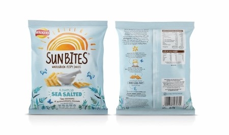
The original packaging had been entirely focused on emphasising the wholegrain content of the product. We established an original, exciting, colourful illustrative style and language to reflect just how tasty, light and enjoyable Sunbites actually are and to engage new consumers who were attracted to the idea of trialling a healthier, tastier snack. The appearance needed to be very different from anything else that Walkers does.
So, we worked with Walkers to develop the core proposition 'Tiny Moments of Extraordinary Pleasure', which served as a descriptor for both the product and the category. Focus groups responded positively to our new design, commenting: "I love this image as it relates to the name and is eye catching", "I like the different fonts. It makes the product seem like a fun thing to have and eat", and "Looks nice and bright and is eye catching enough to want to check it out."
Sales uplift
From the outset the new packaging created a buzz in the salesforce, with extremely positive feedback. That enthusiasm was taken by the team into their key accounts. Given that a pack change on an existing brand often sees an initial fall in sales as consumers unfamiliar with the new identity fail to see 'their brand', it was an immediate vindication of our work to see Nielsen sales data revealing a 26 per cent uplift in sales for the first three months.
The Millward Brown Tracking data also told a very positive story. Consumers' perception of the brand, reflected in the 'Brand Regard' measure increased by 23 per cent in just 12 weeks after the new packs were introduced. This improved perception was particularly evident in key areas: 'are high quality', 'have flavours you like', 'are great tasting' and 'are acceptable to eat as part of a balanced diet'.
Long-term shift in perception
This was no short-term spike. Sales of Sunbites have risen from £8m before the rebrand to more than £40m now. It was a long-term shift in perception from a dull, worthy product to a one that is healthy but also tasty. It shows just what can be done by packaging design alone. It is worth noting that this relaunch was supported by advertising but this only began after the initial three month period. Sales increased 26 per cent without any above the line support.
It is a remarkable success story and one that many other food brands could emulate. Certainly it is not relevant to all. Some products are undeniably unhealthy, while others do indeed taste of cardboard, but between these two extremes is a vast swathe of the food category that has allowed itself to be caught up by the tidal wave that is the healthy eating movement and end up dumped on one side or the other of the healthy-tasty divide.
The Sunbites story shows that crossing the divide between 'healthy' and 'tasty' is possible - says Adrian Collins, MD of Ziggurat Brands. Perceptions can be changed. It requires the right product, a willingness to invest in a rebranding strategy, and a partner who can find the authentic thought that resonates at the core of the brand and then craft compelling packaging design that will inspire consumers to purchase. It is by no means easy, but it can be done.