
"The graphic design features a vibrant new colour palette which, combined with intricate splash and drip detailing, visually communicates J20’s fruit taste and liquid refreshment," the agency said in a statement.
Blue Marlin has also worked with Britvic to create three new limited edition J2O variants: Glitter Berry (pictured below left) Papaya Punch and a commemorative Golden Jubilee pack Diamond Berry, all of which were rolled out from late last year.
Simon Pendry, Blue Marlin creative director, said: “The aim of the redesign was to bring J2O’s fruit mixology back to life. We replaced the previously flat label background with a gradient and shading, to create a new depth around the brand marque that increases its impact and embodies its multi-dimensional fruit combinations.”
Finished with white highlights and contemporary typography, Blue Marlin described the new graphic expression as more uplifting and engaging.
A new 275ml bottle created by the agency's structural designers has a "seemingly taller, more sophisticated shape", that was designed to appeal to an on-trade adult audience, with a slimmer shape reflecting more refreshing recipes, Blue Marlin said.
Helen Gorman, brand controller at Britvic, said: “The new structure and graphics work beautifully together to underscore J2O’s positioning as a premium, modern brand.”
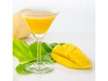
The redesign supports reformulated recipes for core J20 variants: orange and passion fruit; apple and raspberry; apple and mango.