In other words, two types of consumers, three kinds of drinks, and also a whole lot of competition – both from Gatorade and Powerade and also products like Muscle Milk, Vitaminwater, and many others.
Sure, the nutrition products retailer has a strong heritage and reputation, which was one of the characteristics that made Shadow excited to work on the product development end, said Sam Jones, the company’s co-founder. But that reputation for functionality and performance had to be visualized on a packaging and design level to make the product work.
According to Jones, a lot of the initial design process came through looking at the category parameters, trying to crack the code so that they could apply it to the new line.
“We went through the design levels and looked at brands in the category high to low,” Jones said. One key idea was the incorporation of the colors black and white as part of the design scheme, with black indicating “Performance Level.”
As for the bottle itself, with what would eventually turn out to be 17 varieties of the line, a standardized bottle was important.
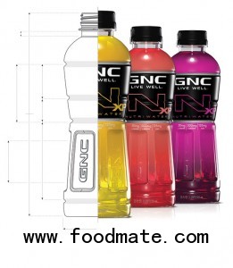
“The bottle itself was a challenge,” said McLean Design founder Ian McLean, who was brought on by Shadow to help create the line. “We wanted something that was contemporary and refined – just as carbonated beverages have migrated to sleeker shapes, we wanted something that was grippable – consistent with active sporting conventions of the brand. Something that was sleek and precise and engineered, one that would work with protein to both sides of the equation, from extreme to active. What we came up with is loosely the silhouette of a fit person.”
Good package design doesn’t just have to appeal to the consumer, it has to make sense for the distributor and for the retailer – both to help the product get onto the shelf but also for it to get onto the shelf and tell the brand story in the right way.
Color, again, helped satisfy those operational objectives, according to Jones.
“We’re a young brand, but we’re complex,” he said. “If you’re an older brand, like Vitaminwater, they have 38 SKUs – it’s complex, but that’s okay. The one continuity piece, when you break down a DSD distributor or retailer, it’s your price point. And we’re lined by price point and by color in our XP (extreme performance) line, and in our Active line. That’s what helps them sort it out.”
Still, getting the brand to the shelf and then having it fly off the shelf are the final test. Safeway has bought into the idea, incorporating end-cap displays through the fall, while recently large independent distributor Polar Beverages took on the line for its broad New England account portfolio. But the final judgment goes to the consumer. That’s where real visual design cues become important, and where McLean really went to work – although he also decided that some things couldn’t be improved on as well, for example a brand name that implies very “positive baggage.”
“You see GNC, and you see water, or sports drinks, you already know what you’re getting,” he said. “So just by announcing the GNC brand loud and proud casts that beneficial shadow across what we’re putting out there. Everything they need to know about GNC, their history of excellence in sports nutrition, that’s there already – just by putting it on the bottle. So we were already starting off way ahead.”
But GNC has a down side as well – it’s got a laboratory feel, one that is associated with pills and powders as much as it is with refreshment. There, McLean decided to stay wonky, but with flair.
Certainly one of the things we had to deal with was the overall semi-clinical nutritional visual personality,” he said. “If you were to say Snapple is a guy in a straw hat and a pair of shorts, we’re more likely to be in a lab coat. It’s just much more clinical than other kinds of healthy foods. So we wanted the entire product line to maintain that clinical personality as a point of differentiation.”
To bring that out, the design team used the amount of coverage of the liquid inside the bottle as a kind of “level of efficacy” indicator. For an enhanced water product, says McLean, “we showed much more liquid, much less label – it’s more about flavor, unadulterated clarity, refreshment – it’s a refreshing beverage and you should see a lot of it. The more stuff that goes into the package, the more label there is.”
Moving up to a protein-enhanced product, then, the brand comes in a full shrink-wrap – with the side benefit being the protection of the protein itself.
“To us, it makes sense,” McLean said. “To the consumer, it makes sense. And from conception they were visualized as end-caps, as an aisle, because a design is only as good as its ability to do something beneficial at shelf. Clearly we work from a sense of what should it look like – how we came up with the label and the system – and then we also started building displays and visualizing how this would look to the consumer. They needed to feel like one big team, but with very identifiable parts of the team.”
With the uniforms in place, it will be interesting to see how far the team can go.
WHAT’S NEW WITH PACKAGING?
We might know what consumers want – according to a study by the research service Packaged Facts, they’re interested in easy open-and-close, ease of pouring and serving, and easy to hold. But we’re more interested in what we want – more cutting edge package designs that are just waiting for the right product to drive them to the front of the shelf. Here are three that caught our eye:
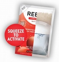
1. In ReBootizer, there’s a product that’s currently packaged in a small two-stage pouch that can allow products that need to eventually be combined for consumption to stay fresh while waiting for the use occasion. But it’s also a test-run for the shaker pack.

“This kind of package is where beverage is going,” says Jack Brennan of GBS Growth Partners, which is working with the “Detox Shaker” company to get off the ground. The product is just one of many that he sees as being possible to package in the shaker pouch, which is combined when the user squeezes hard enough to break the seal separating the two sides of the packages, then combines the elements by shaking it. GBS is currently speaking with strategic innovation partners to try to determine the best route for further commercializing the package.
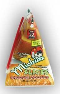
2. From small entrepreneurial enterprise to international packaging giant, we found that Tetra Pak has re-introduced its triangular-shaped Tetra-Classic Aseptic pack, a 150 mL carton that is being used for new kids’ beverage Mickey’s Slices. It’s available in sizes from 65 to 200 mL.

Meanwhile, the organization is taking aim at the adult market with a play on the traditional carton format for multi-serve products, the Tetra Brik Aseptic Edge and Tetra Gemina Aseptic, both intended as juice and milk packaging aimed at singles and childless couples. Both offer high visual shelf impact while being easy to grip and pour — an attractive feature for legions of aging baby boomers. They’re also offering clear manufacturing advantages – the Gemina is the first roll-fed gable-top package in the world, according to the manufacturer.
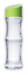
3. Finally, when it comes to packaging that tells a story, the Neuro bottle might have shape advantages, but we really liked this Bamboo beverage bottle from BevMarketing Group Company, Inc., that provides the shape of the iconic, scalloped wood while also offering the sturdiness of PET. The new 16 oz. bottle is available for waters, teas, and juices and could easily be adapted to high-end uses. Welcome to the rainforest.


