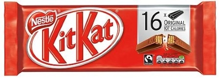
 signed the full UK portfolio of Kit Kat packaging, for both multipack and standalone bars, to capitalise on its unique equity with consumers. Through the addition of the iconic ‘snapping finger’ imagery to reconfirm the iconic and well-loved “have a break” at the centre of the brand’s proposition, the redesign aims to engage with UK consumers from the shelf out.
 Kit Kat has been a trailblazer in the confectionary market over the last decade, innovating by launching limited edition flavours and diversifying the core offering. The new label and packaging reinforces the original and much-loved bar iconography, with an emphasis on quality to reflect Kit Kat’s bestselling status. The new design launches to UK stores initially through two-finger multipacks, and will be replicated later in the year on the four-finger bar.
Mark Ringer, Executive Creative Director at Anthem, said:
“Being a household name, we wanted to make sure that Kit Kat’s new design leveraged the desirable and established icon on pack to create a clear message. Through the snapping finger, we’re communicating the brand’s proposition by triggering instant recognition and impact.”