 rganic Seed and Bean wanted the new design to better reflect the creativity and personality of the brand and be more eye catching for the retailer and consumer.
F&f said it helped the chocolate maker clearly identify its special differences.
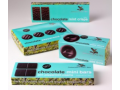
As a result of the rebrand a new logo featuring stems, shoots and buds brings to life the brand’s pure organic credentials, whilst dropping the previous ampersand in favour of a simple ‘and’ to connect the name.
Behind the logo on each pack is a petal-like kaleidoscope to describe the bar’s flavor, this, combined with a palette across the range.
Derek Johnston, co founder and creative partner, said that through collaborative workshops, F&f managed to understand that the client’s flavour combinations outstrip the competition.
“That’s when the ‘AHA’ moment happened for us – Seed and Bean chocolate acts like a natural ‘flavour kaleidoscope’ – huge sensorial pleasure in every bite. The rest was easy!”
Additionally, a new strapline was introduced: ‘Kaleidoscopic Moments of Pleasure’, to drive awareness of the products flavor combinations, as well as giving the brand greater appeal to a younger audience.