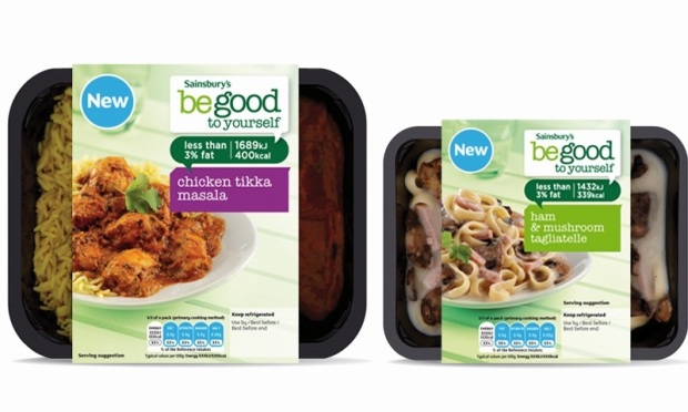
 w design is intended to create an “accessible brand” that communicates the range’s health and nutritional values.
According to Fab Design, an al fresco dining style look has been created to appeal to the consumer and reinforce the feel of a healthier style of living.
Tim Poplett, client services director for Fab design said: “The customer research confirmed the new design combines all the elements to suggest ‘better for me’ and ‘diet’ while ensuring a tasty looking, modernised, engaging and appetising brand”.


