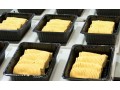
Pearlfisher has created the brand strategy, identity, packaging, and website design for Just Enough of a (Very) Good Thing, a new single serving desert offering for adults. Just Enough of a (Very) Good Thing is an indulgent treat available in 6 mouth-watering flavors, including Key Lime, Chocolate & Vanilla, Tiramisu and Lemon Cream.
In a category where the design aesthetic is traditionally over indulgent and uses dark, sensual cues, the design for Just Enough of a (Very) Good Thing is purposefully light, imaginative and ingredient focused. The illustrated logotype and packaging design emphasizes the handcrafted and premium taste of the deserts. This crafted feel is extended to the design of the website, allowing a seamless transition from one brand experience to another.
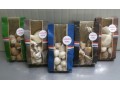
Hamish Campbell, Creative Director at Pearlfisher comments: “We have created a refreshing and unique design that showcases the high quality and flavor experience of Just Enough of a (Very) Good Thing. Bursts of color are used to emphasize flavor and taste. The colored tags on pack work to differentiate flavor as well as highlighting the thought and care that has gone into the making of each desert. The ‘J’ of the logotype has been designed as a spoon, emphasizing the moment of taste sensation when you enjoy a Just Enough of a (Very) Good Thing dessert.”
Noel Labat-Comess, Founder of Just Enough of a (Very) Good Thing says, “Pearlfisher’s design has created an indulgent on pack experience that truly represents the care and attention that goes into each product and the premium nature of the product within. The level of attention to detail in the design sets it apart from other competitors in the market and I couldn’t be happier with the work Pearlfisher has done.”