 Where many designers have begun to make use of minimalism for product packages, Popeye Energy Drink packaging employs an older method. I’m referring to the use of bright colors and busy graphics that was particularly popular as a means to catch the consumer’s eye, but there is indeed more history to the image of this brand.
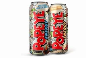
The name of the beverage is that of the 1930s spinach-eating sailor, scrawled across the pop can in the same typeface as the signature of its cartoon namesake. Behind the red writing is a montage of comic strip scenes, replicated with large-dot printing and representing the quirky hero and his companions. New life is given to the animated cast, just as the healthy contents of Popeye Energy Drink packaging will bring the drinker a second wind.