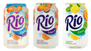
Drinks compa ny Hall & Woodhouse has redesigned the packaging for its Rio brand with the help of design agency Dragon Rouge.
The drinks manufacturer invited Dragon Rouge to evolve the packaging design, refresh the proposition and enhance the brand identity for the Rio fruit crush product, which was launched 20 years ago and was 'in need of a brand refresh', according to the design agency.
Commenting on the redesign, Marie-Therese Cassidy, Creative Director at Dragon said, “Our new refreshed packaging strengthens the Rio identity, increases the natural fruitiness and spring water communication, and significantly increases appetite appeal in order to tempt in new audiences to this vibrant fruit experience."
The design agency said it aimed to focus on Rio’s taste and ingredients, responding to research that showed consumers knew the Rio name but didn’t know much about the drink itself.
'Our research highlighted that while the Rio brand was hugely motivating to loyalists as a delicious drink made with natural fruit juice and lightly sparkling spring water, the majority of consumers, though recollecting the name, had little knowledge of the drink itself', Dragon Rouge said.
'Our challenge was therefore to dial up the bold refreshment cues and communicate Rio’s intrinsic taste and naturalness on the can to achieve much greater shelf impact and brand awareness and improve its potential in retail and convenience outlets'.
The design was then applied across three products including Tropical, Tropical Light and the newly reformulated Citrus, made with a blend of lemon, lime and orange flavours.
 ny Hall & Woodhouse has redesigned the packaging for its Rio brand with the help of design agency Dragon Rouge.
The drinks manufacturer invited Dragon Rouge to evolve the packaging design, refresh the proposition and enhance the brand identity for the Rio fruit crush product, which was launched 20 years ago and was 'in need of a brand refresh', according to the design agency.
Commenting on the redesign, Marie-Therese Cassidy, Creative Director at Dragon said, “Our new refreshed packaging strengthens the Rio identity, increases the natural fruitiness and spring water communication, and significantly increases appetite appeal in order to tempt in new audiences to this vibrant fruit experience."
The design agency said it aimed to focus on Rio’s taste and ingredients, responding to research that showed consumers knew the Rio name but didn’t know much about the drink itself.
'Our research highlighted that while the Rio brand was hugely motivating to loyalists as a delicious drink made with natural fruit juice and lightly sparkling spring water, the majority of consumers, though recollecting the name, had little knowledge of the drink itself', Dragon Rouge said.
'Our challenge was therefore to dial up the bold refreshment cues and communicate Rio’s intrinsic taste and naturalness on the can to achieve much greater shelf impact and brand awareness and improve its potential in retail and convenience outlets'.
The design was then applied across three products including Tropical, Tropical Light and the newly reformulated Citrus, made with a blend of lemon, lime and orange flavours.


