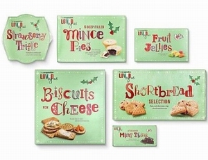
 d on The Co-operative’s standard food range and is based on the ‘Loved by us ‘ design strategy created by the agency earlier this year to showcase the retailer’s food credentials and to appeal to younger consumers.
Also appearing on point-of-sale material and in-store decorations, the identity aims to add a warm, homely and charming feel to The Co-operative’s Christmas food range with a lively new script set on a pastel green background. The combination of hand-drawn letterforms creates a unique Christmas typeface for The Co-operative.
Some of the new letters in the identity were drawn from scratch. Others are embellishments of classic type-faces. There are four variants of each letter but upper and lower case aren’t necessarily related. The letters appear in a range of unusual Christmas-inspired hues and are set in varying heights from the baseline.
The effect is intended to be playful, lively and hand crafted, reflecting The Co-operative’s love and passion for food.
Stephen Bell Executive Creative Director at Coley Porter Bell said: “This identity had to stand out in the supermarket across different categories. To do that we chose a typographic rather photographic lead route. It is playful, festive and has a crafted feel, which supports the range’s food values and personality. They don’t look like the usual Christmas food range.
“This shows that key moments in the retailing year such as Christmas, which attract a lot of infrequent shoppers, can be used as a brand-building as well as a trading opportunity.”


