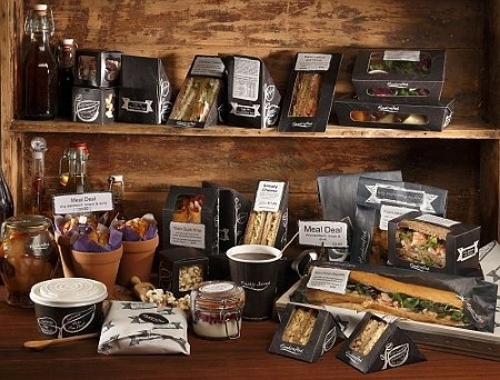
 eco packaging provider - Planglow - has found, that whilst the catering industry is now more environmentally minded than ever, providers are choosing natural-style branding less and less. Planglow has seen sales of its 100% biodegradable and compostable packaging increase nearly a third (29%) in the past twelve months, contributing a steady growth of packaging sales (81%) over a three year period. Yet the natural eco look - favoured by food providers for nearly a decade - is now being superseded by bolder, bespoke and more premium branding options.
One of the easiest and most cost effective ways for providers to tailor their existing offering and make a bold branding statement is to introduce bespoke labelling. And during April 2013 - March 2014, growing numbers of businesses did just this, as sales of Planglow’s custom design products demonstrate: custom design sheet labels increased 12% on the previous year and custom design roll labels by nearly double this - 21%.
Many food providers extended a new look to their packaging too with sales of Gastro - Planglow’s bold new deli-styled range - outstripping those of the company’s other three branded collections. In fact, of all its 400+ product range, the Gastro Deep-fill Wedge was the company’s biggest selling product of last year. With nearly half (47%) of all deep-fill wedges sold being Gastro, and sales of the product increasing more than five-fold (530%) on the previous year.
Planglow’s marketing director Rachael Sawtell commented, “We first observed a subtle shift towards more strongly branded products in 2010 – primarily through our dedicated design team and in-house branding agency Glo Creative. Fine dining establishments had been showcasing a darker more stylised look for some time, and other facets of the catering industry were starting to follow suit. There was a distinct move away from the more traditional natural look (plain kraft), towards bolder and more personalised offerings. We developed Gastro specifically for those providers that wanted to introduce a premium, deli-style and a stronger, darker brand. Bolder brands then snowballed last year with textures, flat colours and curvaceous, characterful fonts emerging everywhere.”
“We believe this shift has come about due to the high number of catering businesses now employing environmentally friendly practices as standard. An argument supported by the findings of the 2014 Gram Green Paper which stated that nine out of ten (91%) respondents are now practicing green initiatives. Perhaps even more significantly, four out of five (83%) of respondents now describe their catering business as a green one. So with eco credentials almost a given, it’s no surprise that many providers are experimenting with a bolder, brighter brand - even if that brand is being applied to classic, natural packaging. And the more engaging and memorable your branding, the better this is for your business”.
Get the Look
Kerry Mundy-Allen - head of design at Glo - describes two current key looks for branding:
“Minimalist Vintage: The vintage look remains prevalent but should take a sharper more minimalist direction - greys offer the perfect balance of versatility and industrial edge. Greys also sit well with most pallets - especially muted ice-cream tones - and exposed / raw materials such as brick work and other industrial elements within your interior.
“Casual Lettering: Fonts should be stripped back, super simple san serif’s, or hand drawn-style lettering. This remains in keeping with the paired back casual look though, if embellishment is to be found, it will most likely be in the lettering”.


