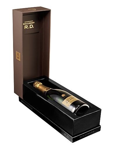
 PPS was asked to produce a luxurious, eye-catching box for Bollinger's celebrated R.D Champagne, which stands for Recently Disgorged; a style introduced for the first time by Madame Bollinger in 1967.
The concept for the box was produced by Johann Klaus Graeber. The development process for the packaging was relatively lengthy as PPS was set difficult challenges by using different substrates and finishing effects. In addition, the construction of the box had to be very precise to ensure the perfect closure.
The box is designed with very sharp, square corners and in a ‘block' format, giving it a perceived look of a solid wooden box rather than paper and board.
This cleverly positions the box in an even higher premium category but with a lower price point. The lid is covered in soft touch matt brown paper, which contrasts with the high gloss black base. This provides a visual and tactile juxtaposition, helping to heighten the consumer senses when exploring the box for the first time. The artwork on the lid is simple and elegant, with the Bollinger name appearing in gold foil, with a 3D effect emboss created for the R.D. initials on the front panel. This sculpted emboss creates a point of intrigue and draws attention to the brand logo.
The base is specially designed to avoid any unsightly bumps or traces of glue trapped underneath. The effect is a perfectly smooth mirror-like surface giving the impression of it being a wooden or acrylic box. The Bollinger logos have been subtly screen printed onto the bottom plinth of the base so as to be noticeable without detracting from the main branding on the lid.
The ingenious part of the box is the construction, as not only does it have sharp corners and a solid feel, but it can be uniquely displayed two ways in store. The lid can be slotted into the two black bases on either the vertical or horizontal edge.


