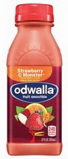
“We really wanted to create something eye catching, easy to understand, that really communicates the benefits of the product,” said Irma Shrivastava, Odwalla’s Vice President of Marketing.
To coordinate the brand’s different segments, there’s a green cap for “superfoods,” a red cap for fruit smoothies, blue for proteins, orange for juices, purple for quenchers and yellow for seasonal products.
“[Consumers] come to the shelf looking for that benefit,” Shrivastava said, “and we make it easier to find the flavors that are available.”
Beverages with the new design have already hit the shelves, while redesigned food bars will be rolled out in February. The redesign will span across all Odwalla product offerings, the company website and even delivery trucks. And while the exterior has changed to ease the shopping process, the product remains the same.
Shrivastava said that the design, which was created by Hatch Design of San Francisco, modernizes the logo and allows shoppers, distributors and retailers to concentrate on what really matters, such as Odwalla’s range of health benefits. She also said that the typeface, font and even the bird on the front of the package help convey Odwalla’s whimsical nature and easygoing business model.
“Early indications are that consumers and retailers are quite keen on it,” Shrivastava said.


