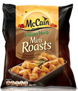
 Frozen food brand McCain has launched a redesign of its logo and product packaging, the first major change for the company in over 50 years -- but thus far, it seems, only in Australia.
The new design sees the previous 'black box' logo replaced with images of sunshine and a natural landscape, and the overhaul took McCain's design agency BrandOpus over six months to develop.
"BrandOpus' portfolio re-frames the way people see our brand -- to drive reappraisal, improve visibility and act as an anchor for our renewed focus on leading category growth," said Mike O'Brien, marketing director at McCain Foods ANZ.
"We were challenged by McCain to imbue their brand identity with new meaning," said Paul Taylor, executive creative director at BrandOpus. "Establishing the sunshine as the new symbol for the brand reflects the warmth and positivity of a natural world that will ensure the consumer reappraises the role of the brand."
The redesign is said to be part of McCain ANZ's move to drive brand and category growth in Australia, and the new packaging is already available in some stores. But the old logo is still featured at the website of parent McCain Foods Ltd. of Canada, where as of April 24 the news link hadn't made any mention of the redesign -- although it had announced McCain ANZ's acquisition of Kitchens of Sara Lee (Australia) Feb. 5.


