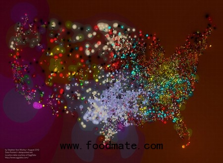
Here's an infograph that makes fast food look a lot smarter than it probably should. Designer Stephen Von Worley put together data on all the McDonald's, Burger Kings, and Wendy's in the country, along with five regional chains, that tell us their frequency in a given place and their market dominance (based on a scale used in that nifty dollar-tracker Where's George?). As Von Worley explains to Fast Company: "Any point where McDonald's dominates is a darker color, because it's more than half (4/7) black, with the colors of the other two chains shining through, at low intensity." In other words, the color mix is determined by the colors associated with the top-three chains in that area: McDonald's (black), Burger King (red), Wendy's (yellow), Jack in the Box (magenta), Sonic (periwinkle), Dairy Queen (cream), Hardee's (cyan), Carl's Jr. (green).
The Golden Arches have a hand all over, with the exception of some pockets in the Western states. Sonic dominates Texas, Jack in the Box owns some large tracts in Southern California and the West Coast generally, and Hardee's (second-to-last on the list) influences much of the midwest into Kentucky, Tennessee, and the Virginias. Oddly enough, the states where McDonald's and Burger King don't exactly saturate the market are also associated with higher obesity rates. To figure out what exactly that says about McDonald's health plan would, of course, require more infographs. [via Fast Company Design]


